CW

LONELY PLANET

Search &

Navigation

ROLE

Lead designer

RESPONSIBILITES

Research
User testing
UX / Visual design

THE PROBLEM

As lonelyplanet.com expands, areas of the site are becoming increasingly difficult to discover. 
The existing navigation had a goal of limiting navigation items the three core areas of the business: Destinations – information about the world, Shop — The print side of the business, and Booking — Trip planning and trip booking. The limitation of three items was working well, but the categories made it difficult to find a home for new sections of the site, as proven once adding ‘video’ to the nav became a priority. It was time to revisit the way visitors navigate our site, and come up with a solution that was scalable and future-proof.

Current navigation

As the site grew, it became difficult to find a home for new sections. The goal was to limit the navigation to 3 items – a convention we had to break once adding video to the navigation became a priority.

Research

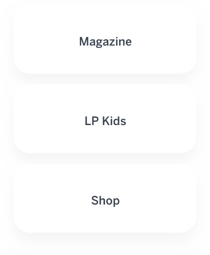
To kick the project off, we dug deep through our analytics and user feedback. We identified trends and potential problem areas. After that, we wrote out all the pages that would need to live in the global navigation and ordered them into like groups:

Structure

Now that we knew what we were including, and had some symblance of categories, we had to figure out what to name them. We tried several tests with users, and after a lot of tiral and error we discovered a way to arrange and title the sections that tested as the best solution:

Planning

Based on research we had completed earlier, we found that more users were finding destinations through search than they were through the destinations navigation dropdown, this made the destinations callout in the navigation redundant. We decided to refocus search as a destinations callout. We then proceeded to conduct an enormous amount of work on search. I'll spare the details, but know that it included a lot of research, analysis, user testing, and fancy diagrams like these:

Design

At this point we had several ideas around what people are using our current navigation and search for. We knew where we were falling short and where we could possibly improve. After several iterations, we landed on a design that makes use of large dropdowns, and an enhanced predictive search.

01. Default state

Search has been renamed to “Find a destination” Destinations has been moved out of the right side of the nav. Navigation items have been renamed to: Latest, Travel, and Shop.

02. Search is initiated

To aid in discovery, trending destinations, popular searches, and popular topics are added to initial search dropdown.

03. Auto complete

To accommodate the multiple content types on lonelyplanet.com, a 4 column autocomplete is utilized.

04. Search results

The search results page returns results based on keyword. Order is determined by an internal score based on various metrics.

User feedback:

“This is perfect! Everything is exactly where I expected it to be.”

USERTSING.COM USER

“I LOVE the trending destinations, this would help me find new places to travel to.”

USERTSING.COM USER

“This makes a lot of sense, it's very easy to find everything.”

USERTSING.COM USER

01

LONELY PLANET

Search & Global navigation

Helping travelers discover the world

02

LONELY PLANET

Detail & list pages

Getting to the heart of a destination

03

SURGERY PARTNERS

Healthcare website

A website for one of the largest surgical services businesses in the country

04

ATHLETE NATION

Athletic coaching app

Revolutionizing the relationship between the athlete and the coach

05

CHRIS WHITSETT

Everything else

Various projects from the past decade